If you’re in the education sector, you know that your website is often the first place a prospective student visits. Think of it like a virtual campus tour that can make or break their decision to apply. A polished, professional, and honest website isn’t just about aesthetics; it’s a promise. It says, “We care. We’re legitimate. We want you here.” Today’s students are savvy. They don’t just skim over glossy photos—they dig deep, reading program descriptions, checking faculty bios, and even looking for reviews from alumni. They’re making one of the biggest investments of their lives, and your website is their window into your institution’s soul. But attracting students is just one part of the story. The real challenge? Building trust. A flashy site without substance will backfire. Students expect transparency about tuition, accreditation, and career outcomes. They want easy navigation, compelling content, and a sense of belonging before they set foot on campus. In this guide, let’s dive deep. We’ll look at how academic websites can stand out, earn trust, and turn curious visitors into enrolled students. Whether you’re a university, college, online learning platform, or even a small training center, these strategies apply.
Ready? Let’s break it all down step by step.
Understanding Student Behavior Online
The Digital-First Generation
Today’s students are true digital natives. They grew up with smartphones in their pockets and answers at their fingertips. When they research schools, they expect the same convenience and responsiveness they get from their favorite apps.
But convenience alone isn’t enough. They want information fast, but it must be thorough. They’ll bounce if your site is slow, clunky, or feels outdated. They’re also skeptical; they know how to spot generic marketing speak versus real, student-focused content.
Universities that understand this mindset design experiences with students in mind. They use simple language, intuitive layouts, and mobile-friendly designs. It’s not just about looking good on a desktop anymore; most initial visits happen on mobile. If your site fails there, you’re losing potential students before you even have a chance.
What Students Look For in Academic Websites
- Authenticity: Are the promises real? Do testimonials feel genuine?
- Transparency: Are tuition fees clear? Are program requirements detailed?
- Ease of Use: Can they find the information they want quickly?
- Interactivity: Can they ask questions, book a tour, or chat with admissions?
- Emotional Connection: Does the site feel welcoming? Can they see themselves there?
Imagine shopping for a car but never seeing the price, reading vague specs, and being unable to ask questions. That’s how a bad academic site feels to students. They want clarity, confidence, and control.
In short, understanding your audience is step one. Before you tweak a single pixel, think like a student.
The Importance of Trust in Academic Websites
Credibility and Authenticity
Trust is earned, not given. And in the world of higher education—where students might invest tens of thousands of dollars—it’s essential.
A credible academic website doesn’t rely on hype. Instead, it builds authority through facts, consistency, and professionalism. Think of it like a well-researched paper: sources are cited, claims are backed up, and tone matters.
Ways to boost credibility include:
- Accreditation badges are prominently displayed.
- Faculty credentials with real bios and photos.
- Detailed course information that’s not vague or misleading.
- Awards, rankings, or industry recognition.
Remember, students are smart. They can tell if you’re trying too hard to sell without providing substance. Instead, let the strength of your programs and people speak for themselves.
Transparency and Honesty
Nothing destroys trust faster than a bait-and-switch. If your homepage promises “affordable education,” but tuition is buried behind forms, students will feel tricked.
Transparent websites lay everything out:
- Tuition and fees.
- Admission requirements.
- Expected timelines.
- Financial aid options.
- Career placement stats.
Honesty also means acknowledging weaknesses. Maybe your campus is small, or your program is niche. Own it! The right students will appreciate your candor.
Building trust is like building a relationship. It requires openness, consistency, and a willingness to answer tough questions.
Key Features of Academic Websites That Attract Students
User-Friendly Design
Navigation That Makes Sense
Ever landed on a website where you couldn’t figure out where to click next? Frustrating, right? For academic websites, this is a disaster.
Good navigation is intuitive. It’s predictable in the best way. Categories should match student needs, not internal jargon. For example:
- Programs and Degrees
- Admissions
- Tuition and Financial Aid
- About Us
- Contact
Navigation should also be consistent across pages. No one wants to relearn your site every time they click.
Mobile Responsiveness
More than half of all student website visits happen on mobile. If your site doesn’t adjust beautifully to different screen sizes, you’re done.
Mobile responsiveness isn’t just resizing. It’s rethinking the user journey. Buttons should be tap-friendly, text readable without zooming, and forms easy to complete on the go.
Beyond usability, Google now prioritizes mobile-first indexing. If your mobile experience is poor, you’ll rank lower in search results.
Clear and Compelling Content
Program Descriptions
Students want details. Not marketing fluff.
A strong program page includes:
- Degree or certificate overview.
- Curriculum breakdown.
- Learning outcomes.
- Admission requirements.
- Career prospects.
- Costs and duration.
Don’t force visitors to download a PDF for basic info. Put it right there on the page.
Faculty Profiles
Faculty are often the selling point for a program. Students want to know:
- Who will teach them?
- What are their qualifications?
- Do they have industry experience?
- Are they approachable?
Photos, bios, and even short videos can make faculty feel real and accessible.
Visual Appeal and Branding
Professional Imagery
Stock photos are easy—but they’re also generic. Nothing kills authenticity faster than a photo that screams, “This could be anywhere.”
Instead, invest in real photography of your campus, students, and faculty. Candid shots of classes, labs, and events give prospective students a true sense of life on campus.
Consistent Colors and Typography
Brand consistency builds trust. It signals professionalism and attention to detail.
Your colors, fonts, and style should reflect your institution’s personality. Are you modern and innovative? Classic and prestigious? Your design should say so—visually.
Building Trust Through Transparency
Tuition and Fees Disclosure
Money is a major factor for students. Don’t make them dig to find out what they’ll pay.
Transparent tuition pages include:
- Base tuition rates.
- Fees (technology, student services, labs, etc.).
- Estimated total costs by program or year.
- Payment plans and deadlines.
- Financial aid options.
Some institutions even offer calculators so students can estimate costs based on their situation.
Hiding fees leads to lost trust and lost applications. Be upfront.
Accreditation and Rankings
Accreditation is a stamp of legitimacy. Show it off.
Include:
- Accrediting body names and logos.
- Direct links for verification.
- Program-specific accreditation (for fields like nursing or engineering).
- Recent rankings from respected publications or agencies.
This isn’t bragging—it’s proof. And proof builds trust.
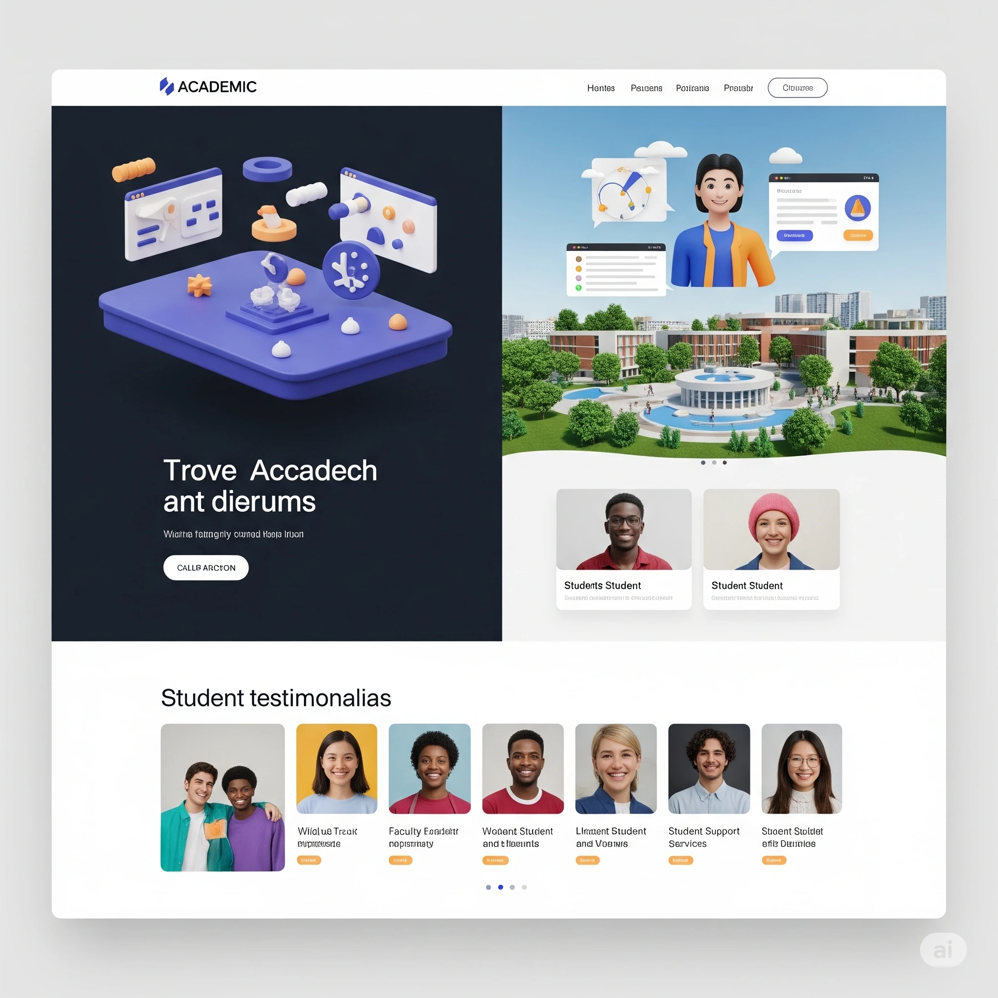
Student Testimonials and Reviews
What better way to convince students than letting your alumni do it for you?
Real testimonials provide social proof. But they must be authentic. Avoid generic “I loved it!” blurbs. Instead, showcase detailed stories:
- Why did they choose your institution?
- What challenges did they face?
- How the program prepared them for work.
Video testimonials are even better—they’re more personal and persuasive.
Effective Calls-to-Action (CTAs)
Simplified Application Process
Let’s be honest—no one wants to jump through hoops just to apply. A complicated, outdated application process is one of the fastest ways to lose a student’s interest.
Your website should make applying as easy as ordering a pizza. Every step should be intuitive and streamlined. Think about this: When a student decides they want to apply, they’re at peak interest. Make sure you capitalize on that moment!
Here’s how:
- Clear CTA buttons: “Apply Now,” “Start Your Application,” or “Schedule a Call” should stand out visually.
- Step-by-step instructions: Don’t overwhelm users with long forms all at once. Break them into clear stages.
- Progress indicators: Let applicants see how much they have left to complete.
- Save-and-return options: Life happens. Don’t force them to start over if they leave halfway through.
- Immediate confirmation: After submitting, send a friendly confirmation email outlining the next steps.
Remember, the goal isn’t just to get applications. It’s to make sure the best-fit students complete them confidently and easily.
Contact and Inquiry Forms
Not every visitor is ready to apply immediately. Many have questions. Don’t make them hunt for your contact information like it’s hidden treasure.
Effective inquiry forms are:
- Short and simple: Name, email, question. That’s often enough.
- Visible: On every page footer, sidebar, or via a persistent button.
- Clear about response times: “We’ll reply within 24 hours” builds confidence.
- Integrated with CRM: Capture leads and follow up automatically.
Bonus tip? Offer multiple contact options. Email is great, but some students prefer live chat, SMS, or even WhatsApp. Meet them where they’re comfortable.
SEO Strategies for Academic Websites
Keyword Research
Your website can be beautiful, but if no one finds it, it’s worthless. SEO (Search Engine Optimization) helps you show up when students search for programs.
Keyword research is your foundation. You need to know:
- What terms prospective students are searching for.
- How competitive those terms are.
- Which long-tail variations can you realistically rank for.
Examples might include:
- “Best online MBA programs”
- “Affordable nursing schools in [City]”
- “How to apply to [Your University]”
Use tools like Google Keyword Planner, SEMrush, or Ahrefs. And remember: target keywords naturally in headings, text, meta descriptions, and URLs.
On-Page Optimization
You’ve got your keywords—now use them wisely.
- Title tags: Include primary keywords and stay under 60 characters.
- Meta descriptions: Make them compelling. This is your ad in search results.
- Headings (H1, H2, H3): Organize content for readers and search engines.
- Alt text for images: Describe images accurately for SEO and accessibility.
- Internal linking: Guide visitors to related pages (e.g., linking program pages to the application page).
SEO isn’t about gaming the system. It’s about making your content clear, organized, and relevant.
Technical SEO Best Practices
If your site is slow, broken, or disorganized, Google won’t recommend it.
- Mobile-first design: A must.
- Fast load times: Compress images, use caching.
- SSL certificates: HTTPS builds trust.
- Clean URLs: /mba-program instead of /page?id=123.
- XML sitemap: Helps search engines index your pages.
A well-optimized site is easier to find—and easier to trust.
Content Marketing for Academic Institutions
Blogging for Authority
Think students don’t read blogs? Think again.
A university blog can answer the very questions students are Googling:
- “How to choose a major.”
- “Scholarship opportunities for 2025.”
- “Career paths with an accounting degree.”
Benefits of blogging:
- Improves SEO with fresh, keyword-rich content.
- Positions your institution as an expert.
- Builds trust by providing real value before students even apply.
Don’t just write for the sake of it. Make posts detailed, helpful, and authentic.
Video Content and Virtual Tours
Students want to see your campus, classrooms, and student life—but travel is expensive. Enter video.
- Virtual tours: Walkthroughs of campus facilities.
- Faculty interviews: Help students get to know their professors.
- Student stories: Showcase real experiences.
Video humanizes your institution. It builds emotional connections in ways text can’t.
And don’t forget social sharing! A good video can spread your message far beyond your site.
Social Media Integration
Students practically live on social media. Your website should make it easy to connect there too.
- Embed social feeds.
- Include sharing buttons on blog posts.
- Add CTAs like “Follow us on Instagram for campus updates.”
Social integration isn’t just marketing—it’s about meeting students in their daily lives and building trust through familiarity.
Leveraging Data and Analytics
Tracking User Behavior
You can’t improve what you don’t measure.
Analytics tools like Google Analytics or Hotjar let you see:
- Which pages attract the most visitors.
- How long users stay.
- Where they drop off in the application process.
- Which marketing channels bring the most traffic.
These insights help you prioritize improvements. Maybe your application page needs clearer CTAs. Maybe your tuition page is hard to find.
Data turns guesswork into strategy.
A/B Testing and Optimization
Don’t assume you know what works best. Test it!
- A/B testing: Show two versions of a page or CTA to see which performs better.
- Heatmaps: Visualize where users click most.
- Session recordings: Watch real visitor interactions.
Continuous testing ensures your site doesn’t just work—it evolves to serve students better over time.
Security and Privacy Considerations
Data Protection for Students
Trust isn’t just about clear pricing or pretty design. It’s about keeping student data safe.
With cyber threats on the rise, your website must:
- Use SSL encryption (HTTPS).
- Store data securely.
- Comply with regulations like GDPR or FERPA.
- Clearly outline your privacy policy.
Prospective students want to know their personal info—names, grades, payment details—won’t be misused or stolen.
Secure Application Forms
Your application form is a treasure trove of sensitive info.
Best practices include:
- Encryption in transit and at rest.
- CAPTCHA to prevent spam.
- Secure backend storage.
- Limited access for staff.
It’s not just about protecting your reputation. It’s about respecting the trust students place in you when they share their dreams and details.
Accessibility and Inclusivity
Designing for All Abilities
An academic website that truly builds trust must be accessible to everyone. Imagine being a prospective student who’s blind, deaf, or has limited motor skills—if your site shuts them out, they won’t just feel excluded, they’ll go elsewhere.
Accessibility isn’t optional. It’s a responsibility—and in many places, a legal requirement.
Here’s how to do it right:
- Screen reader compatibility: Use semantic HTML and proper heading structure so assistive technologies can interpret your content.
- Alt text for images: Describe visuals so blind users understand them.
- Keyboard navigation: Ensure users can tab through menus, forms, and content without a mouse.
- Contrast ratios: Use color combinations that are easy to read for users with visual impairments.
- Closed captions and transcripts: Make all videos accessible to deaf and hard-of-hearing users.
Beyond compliance, accessibility is about empathy. It tells every visitor: “You belong here.” That message is powerful for building trust with diverse student populations.
Multilingual Support
Education is increasingly global. Your prospective students may come from dozens of countries, and many prefer consuming information in their native language.
Multilingual support doesn’t just broaden your reach; it shows cultural sensitivity.
Best practices include:
- Offering translations for key pages (program descriptions, application instructions, tuition details).
- Using professional human translation rather than machine-only translation for accuracy and nuance.
- Providing language selection options that are clear and easy to use.
- Supporting international characters in forms and databases.
An inclusive website understands its audience isn’t monolithic. Offering multiple languages is a powerful trust builder for international recruitment.
Examples of Successful Academic Websites
Top Universities’ Sites
Want proof these strategies work? Just look at leading universities.
- Harvard University: Clean layout, clear calls to action, prominent faculty profiles. They balance prestige with approachability.
- MIT: Highly structured navigation with dedicated sections for prospective students, current students, and alumni. They focus on transparency about programs and research.
- University of Oxford: Beautiful imagery mixed with detailed academic information. Their site conveys both tradition and clarity.
What do these have in common?
- Simplicity.
- Trust-building details.
- Focus on user experience.
They don’t overwhelm visitors with flashy animations or hype. Instead, they make it easy to find information and showcase credibility through real stories and accomplishments.
Innovative Design Trends
Some institutions are going even further by adopting cutting-edge design trends that delight students:
- Micro-interactions: Subtle animations that guide users without distracting them.
- Dark mode: Reduces eye strain and feels modern.
- Personalized recommendations: Suggesting programs or events based on user interests.
- Chatbots: Providing instant answers to common questions 24/7.
These trends aren’t gimmicks—they solve real user problems while making the site feel modern and responsive.
Common Mistakes to Avoid
Overly Complex Navigation
When schools try to be everything to everyone, their websites often become confusing labyrinths of menus.
Students don’t have time to figure it out. If they can’t find what they want in seconds, they’ll bounce.
Mistakes to avoid:
- Too many top-level menu items.
- Unclear labels filled with internal jargon.
- Hidden or buried application links.
- Redundant or outdated pages.
Solution? User testing. Ask real students to find specific info. Watch where they get stuck. Simplify.
Outdated Content
Nothing destroys trust faster than old, inaccurate, or broken content. Imagine reading about a program only to discover it no longer exists!
Common issues:
- Old tuition rates.
- Dead links.
- Faculty who no longer work there.
- Event calendars with last year’s dates.
Fix it by:
- Conducting regular content audits.
- Assigning ownership for updates.
- Automating reminders for key content reviews.
A website is a living thing. Neglect it, and students will notice—and wonder what else you’re neglecting.
Future Trends in Academic Website Design
AI and Personalization
AI isn’t just a buzzword—it’s transforming how schools engage with students.
Imagine a website that:
- Greets returning visitors by name.
- Recommends programs based on their browsing history.
- Offers tailored content for first-time visitors, parents, or international students.
- Uses chatbots that handle FAQs instantly.
Personalization isn’t about being creepy. It’s about relevance. The right content at the right time can reduce overwhelm and make students feel understood.
Immersive Experiences (AR/VR)
The next frontier? Letting students explore campus from thousands of miles away.
- Virtual reality campus tours: Let students “walk” through lecture halls and dorms.
- Augmented reality apps: Enhance physical tours with info overlays.
- 360° videos: Show off labs, libraries, and student life.
These tools aren’t science fiction—they’re real solutions for students who can’t visit in person. They build excitement and trust by offering transparency about what life at your institution is really like.
Conclusion
Attracting students online isn’t just about making a website that looks pretty. It’s about building a digital experience that feels human, trustworthy, and welcoming.
Students are making one of the biggest decisions of their lives. They want to know:
- Is this institution credible?
- Do they really care about me?
- Can I see myself thriving here?
Your website is your answer to those questions. From user-friendly design to transparent pricing, from rich faculty profiles to immersive virtual tours—it’s all about showing who you are, honestly and compellingly.
Don’t treat your website like a brochure. Treat it like a conversation. Invite students in. Answer their questions. Build trust. And watch your enrollments grow.
FAQs
Why is website design important for universities?
A well-designed website is often the first impression students get. It communicates credibility, makes information easy to find, and reflects the institution’s values and professionalism. A confusing or outdated site can drive students away.
How can a university website improve trust?
By being transparent about tuition, accreditation, and program details; showcasing real student stories; ensuring accessibility; and protecting user data. Trust comes from clarity, honesty, and empathy.
What are essential pages for an academic website?
Key pages include: Programs/Degrees, Admissions, Tuition and Financial Aid, About Us, Contact, Faculty Profiles, and Student Life. Additional helpful pages are FAQs, Testimonials, Blog, and Events.
How does SEO help academic websites?
SEO ensures your site appears in search results when students look for programs, making you more discoverable. It improves site structure, content quality, and technical health—leading to more organic traffic.
What trends will shape academic websites in the future?
Expect more AI-driven personalization, immersive experiences like VR tours, accessibility improvements, mobile-first design, and integrations with social and messaging platforms.
Leave a Reply