The healthcare industry is undergoing a massive digital transformation, and a significant part of this change revolves around how patients interact with healthcare providers online. Gone are the days when patients relied solely on phone calls or in-person visits to get information. Today, the majority of people turn to their smartphones for everything from booking appointments to reading about medical conditions.
Recent studies show that over 60% of all internet traffic comes from mobile devices, and this percentage is even higher for healthcare-related searches. Patients expect fast, easy, and mobile-friendly websites. If a healthcare website isn’t optimized for mobile, patients are more likely to abandon it and choose a competitor that offers a better experience.
This is where mobile-first design comes into play. But what exactly is mobile-first design, why does it matter for healthcare websites, and how can you implement it effectively? Let’s dive in.
What is Mobile-First Design?
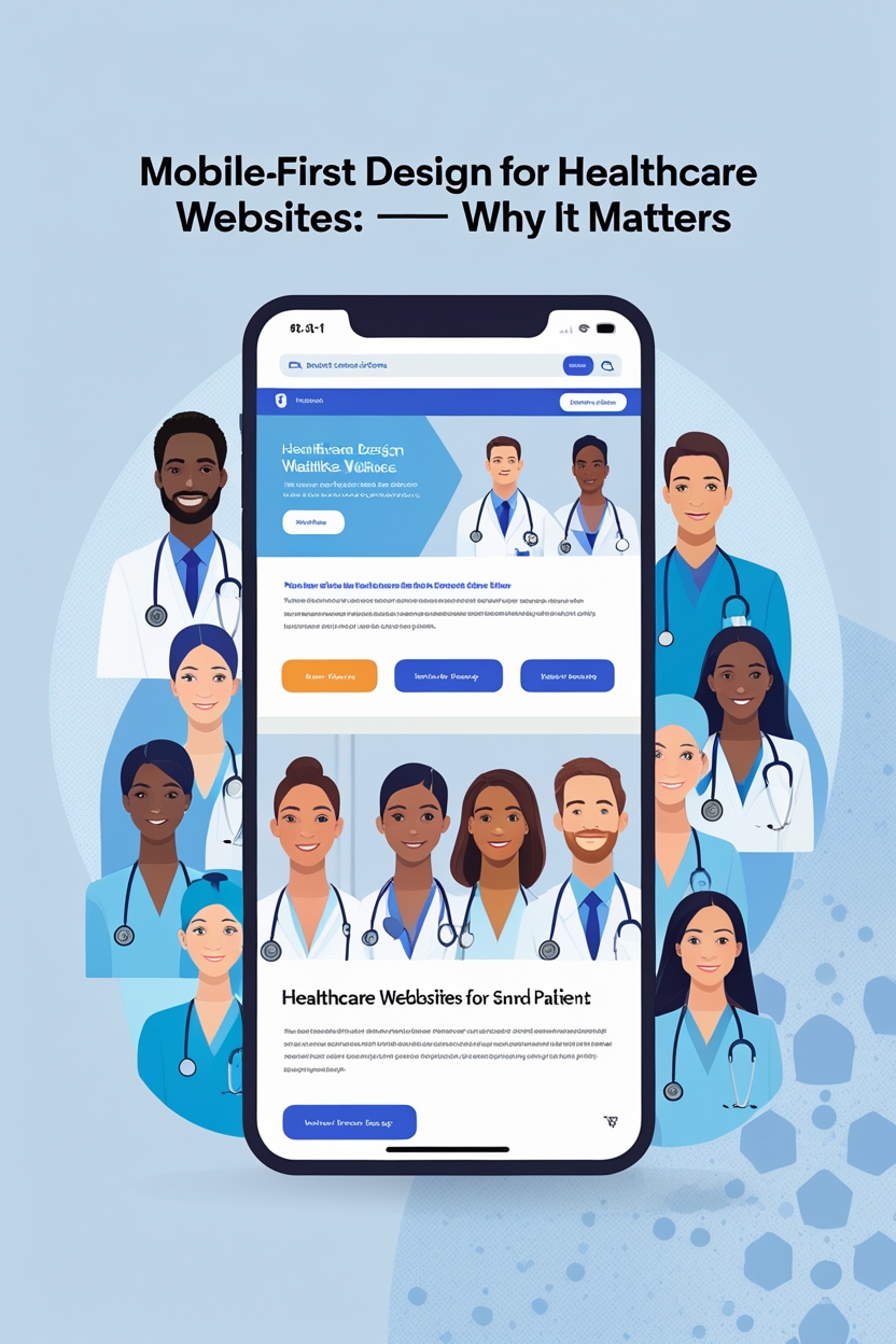
Mobile-first design is an approach to website design that prioritizes the mobile user experience. Instead of designing a website for desktop users and then adapting it for smaller screens, designers start with the smallest screen size first (mobile) and then progressively enhance the design for larger screens like tablets and desktops.
Key Characteristics of Mobile-First Design
- Simplified layout optimized for smaller screens.
- Prioritization of essential features like navigation, contact options, and booking systems.
- Touch-friendly design elements that are easy to use on smartphones.
This approach ensures that the most critical features are easily accessible, providing a seamless experience for mobile users, which is crucial in healthcare.
Why Mobile-First Matters in Today’s Digital World
The mobile-first approach has become a necessity rather than a trend. Here’s why:
1. Mobile Dominates Internet Usage
According to Statista, mobile devices account for over 60% of global website traffic. In healthcare, this number is even higher because patients often search for health information on the go.
2. Google’s Mobile-First Indexing
Google now uses mobile-first indexing, meaning the mobile version of a website is considered the primary version for ranking. If your healthcare website isn’t mobile-friendly, it will hurt your SEO performance and visibility.
3. Better User Experience
Patients expect websites to load quickly and be easy to navigate on mobile devices. A poor mobile experience leads to higher bounce rates and lower patient engagement.
The Growing Importance of Mobile in Healthcare
Mobile technology is transforming how healthcare services are delivered and accessed.
1. Patients Rely on Mobile for Health Information
Before visiting a doctor, most patients research symptoms, treatment options, and nearby clinics using their smartphones. If your healthcare website isn’t optimized for mobile, you risk losing these potential patients.
2. Appointment Scheduling via Mobile
Patients expect to book appointments online, and the process should be quick and simple on a mobile device. A complicated booking system can lead to frustration and loss of patients.
3. Telehealth and Mobile Integration
Telemedicine has surged in popularity, and many patients use their smartphones to attend virtual consultations. Your website must integrate telehealth features that are easy to access on mobile.
Key Benefits of Mobile-First Design for Healthcare Websites
1. Improved Patient Engagement
When your website is easy to use on a smartphone, patients are more likely to explore services, book appointments, and interact with your healthcare brand.
2. Better SEO and Higher Google Rankings
Since Google prioritizes mobile-friendly websites, adopting a mobile-first approach directly impacts your search engine rankings, bringing in more organic traffic.
3. Faster Loading Times
Mobile-first design often involves lightweight code and optimized images, which lead to faster load times—a critical factor in retaining users.
4. Accessibility for All Users
A clean, mobile-friendly design also supports accessibility for patients with disabilities, which is crucial for healthcare websites.
5. Higher Conversion Rates
When patients can easily find information and book appointments on mobile, conversion rates increase significantly.
Challenges in Mobile-First Design for Healthcare Websites
While the benefits are clear, implementing mobile-first design in healthcare websites comes with challenges:
1. Complex Healthcare Data
Healthcare websites often contain a large amount of detailed information. Presenting this in a simple, mobile-friendly format requires careful planning.
2. Compliance with HIPAA and Security Standards
Ensuring patient data security on mobile devices while meeting compliance standards is essential but challenging.
3. Maintaining Performance Across Devices
A website should function smoothly on all screen sizes, from small smartphones to large desktops.
Core Principles of Mobile-First Design for Healthcare
1. Responsive Design
Your healthcare website must automatically adjust to different screen sizes without compromising functionality.
2. Minimalist Approach
Mobile screens have limited space, so avoid clutter. Prioritize essential features like booking, contact information, and emergency numbers.
3. Fast Loading Speed
Optimize images, scripts, and overall site structure to ensure quick loading on mobile networks.
4. Easy Navigation
Use simple menus and clear call-to-action buttons like “Book Appointment” or “Contact Now.”
5. Readable Typography
Use large fonts, clear contrast, and sufficient spacing for readability on small screens.
Essential Features for Mobile-First Healthcare Websites
1. Appointment Booking System
Offer a user-friendly booking form with minimal steps.
2. Telehealth Integration
Allow patients to join video consultations directly from their smartphones.
3. Patient Portal Access
Enable patients to view test results, prescriptions, and medical history on mobile.
4. Emergency Contact Button
Include a one-tap call button for urgent cases.
5. Location and Directions
Integrate Google Maps for easy navigation to clinics or hospitals.
Best Practices for Mobile-First Healthcare Website Design
1. Use a Mobile-First Framework
Frameworks like Bootstrap or Foundation help in creating responsive designs quickly.
2. Optimize for Touch Interactions
Ensure that buttons, forms, and links are touch-friendly with sufficient spacing.
3. Focus on Core Content
Show the most critical information first, such as services, contact details, and appointment options.
4. Test Across Multiple Devices
Test on various screen sizes, operating systems, and browsers to ensure compatibility.
The Role of Speed and Performance
Patients expect websites to load within 2-3 seconds. Techniques to improve speed include:
- Compressing images without reducing quality
- Using Content Delivery Networks (CDN)
- Minimizing unnecessary scripts and plugins
Why Security and Compliance Are Crucial
Healthcare websites handle sensitive data, making HIPAA compliance and data security essential.
Key security measures include:
- SSL Certificates for encryption
- Two-factor authentication for patient portals
- Secure cloud storage for medical data
Impact on SEO and Local Search
Mobile-first design improves search engine rankings. For healthcare providers, local SEO is also critical. Patients often search for phrases like:
- “Doctors near me”
- “24-hour clinics nearby”
Mobile optimization combined with local SEO strategies helps your website appear in these searches.
Mobile-First vs. Responsive Design: What’s the Difference?
While both approaches aim to deliver a good experience across devices:
- Responsive Design: Starts with desktop design and adapts to mobile.
- Mobile-First Design: Starts with mobile and scales up.
Mobile-first ensures priority for mobile experience, which is essential in today’s healthcare landscape.
Future Trends in Mobile-First Healthcare Websites
1. AI-Powered Chatbots
Chatbots provide instant responses to patient queries, reducing wait times.
2. Voice Search Optimization
Patients use voice commands like “Find a pediatrician near me.” Your site should be optimized for voice search.
3. Progressive Web Apps (PWAs)
PWAs offer an app-like experience without requiring downloads.
4. AR/VR for Patient Education
Augmented and virtual reality can educate patients about treatments in an interactive way.
Case Studies of Successful Mobile-First Healthcare Websites
- Mayo Clinic: Offers a clean, mobile-friendly design with patient education resources.
- Cleveland Clinic: Provides telehealth services optimized for mobile users.
- Zocdoc: A platform dedicated to mobile appointment booking with great UX.
How to Implement Mobile-First Design for Healthcare Websites
Step 1: Analyze Your Audience
Understand what devices patients use and their browsing behavior.
Step 2: Start with a Mobile Wireframe
Design the smallest screen experience first, focusing on essential features.
Step 3: Prioritize Core Features
Appointment booking, contact details, and telehealth options should be front and center.
Step 4: Optimize Performance
Use image compression, lazy loading, and caching for faster speed.
Step 5: Test and Iterate
Continuously test your website on real devices and improve based on feedback.
Conclusion
A mobile-first design approach is no longer optional—it’s a must-have for healthcare websites. Patients expect convenience, speed, and accessibility on their smartphones. By prioritizing mobile design, healthcare providers can boost engagement, improve SEO rankings, and enhance patient satisfaction. As technology continues to evolve, staying ahead with mobile-first strategies will be crucial for success in the digital healthcare era.
Leave a Reply